


Weaver news
|
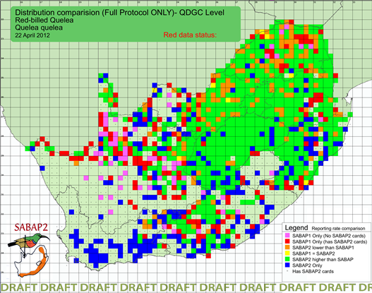
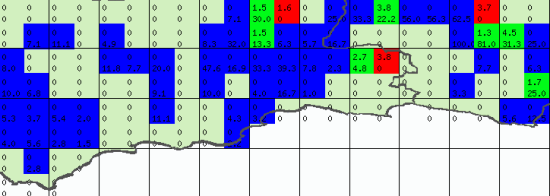
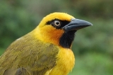
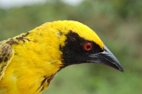
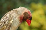
We last examined the range-change map of the Red-billed Quelea about a year ago in this news item. The number of BLUE quarter degree grid cells in the Western Cape has continued to increase since then. The predominant colour of this map is GREEN, indicating that most grid cells have a higher SABAP2 reporting rate now than they had in SABAP1. (The colours on this range change map are explained in the interpretation note below). What we particularly want to highlight now is the size of the SABAP2 reporting rates in the area traditionally called the "Southern Cape" – Little Karoo, the eastern end of the Overberg and the Garden Route, and extending into the western end of the Eastern Cape. During SABAP1, Red-billed Queleas were recorded in only 10 quarter degree grid cells in this region, with a maximum reporting rate of 4.5%. Three of these 10 grid cells are now coloured RED, so Red-billed Queleas have not been recorded in them in SABAP2; but in five of the remaining seven, the reporting rate in SABAP2 exceeds 20%, and in one it is 81%. There are 51 BLUE cells in this map's area. In 22 of them the SABAP2 reporting rate exceeds 10% and there are nine where it exceeds 30%. The Red-billed Quelea is becoming a more-or-less regularly reported species over much of the agricultural area in this region.
This re-examination of the reporting rates of the Red-billed Quelea was prompted by a comment by Maria Kemp in the MyBirdPatch group on Facebook: "We are in for a big problem in the Klein Karoo. The Red-billed Quelea's, which previously only frequented the feeding places of the Ostriches, are now all over the scene, taking over the Cape Sparrow, weaver and bishop parties." Maria's alarming observations are confirmed by the SABAP1 and SABAP2 database. Interpretation note for the SABAP1 vs SABAP2 range comparison maps
Source: Les Underhill |